

Brand kit
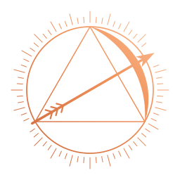
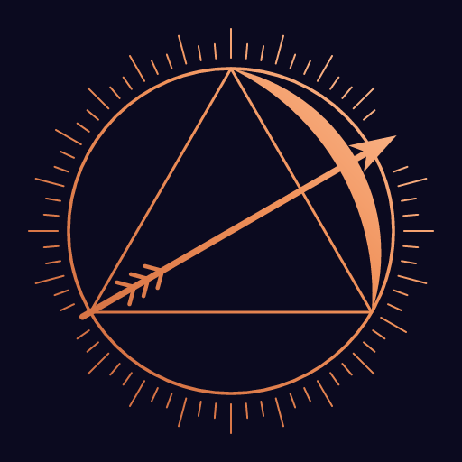
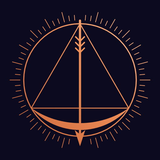
Copper on deep indigo, dark only. The name has two meanings and the brand draws on both: sagitta is Latin for arrow (Rome’s archers were sagittarii), and in geometry the sagitta is the distance from an arc’s midpoint to its chord’s midpoint. Drawn out, that figure is a strung bow with an arrow nocked.

Downloads
Section titled “Downloads”Every file is a hand-written, viewBox-based SVG with no external references and no live text.
| File | What | Ground |
|---|---|---|
| mark.svg (PNG) | The mark | Transparent |
| mark-on-indigo.svg (PNG) | The mark on a #0b0a1f square: avatars, app icons, anywhere a ground is needed |
Indigo |
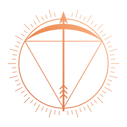
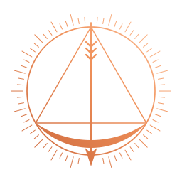
| mark-up.svg (PNG), mark-down.svg (PNG) | The UP and DOWN figures | Transparent |
| glyph.svg | The mark reduced for 16–48 px | Transparent |
| favicon.svg | The glyph on a #0b0a1f square |
Indigo |
| wordmark.svg | SAGITTA in Cinzel Bold with .broker in IBM Plex Mono SemiBold, both outlined | Transparent |
| lockup.svg (PNG) | The mark with the wordmark to its right | Transparent |
| og-background.svg (PNG, 1200 × 630) | Open Graph card background | Indigo |


The mark
Section titled “The mark”An equilateral triangle is inscribed in a circle and read as a drawn bow. The arc over one side is the bow, that side
is the braced string, the other two sides are the string drawn back to the nock, and the altitude through the centre
is the arrow, extended past the ring with a barbed head. Around it sit a thin ring and 72 radial rays. The brand mark
is the figure turned 60° clockwise, so the arrow flies up and to the right. Its copper is lit from the top right:
highlight #ffc8a2, copper #f0915a, shade #c8643a.
UP and DOWN
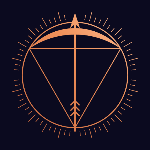
Section titled “UP and DOWN”The UP figure is the bow upright, arrow up; the DOWN figure is the same bow turned over, arrow down.
- They stand for a side, never for the brand: side-token images, the two halves of a market, side pickers, tickets and position cards.
- They always travel with the word UP or DOWN, or ▲ / ▼. Colour goes on the word and the numbers, never on the figure, so the sides never depend on red/green vision.
Palette
Section titled “Palette”The tokens live in packages/tokens (@sagitta/tokens), typed for TypeScript, free of any platform API, and exported
as CSS custom properties. This table is rendered from them.
| Colour | Token | CSS | Hex | Use |
|---|---|---|---|---|
base | --color-base | #0b0a1f | Page ground | |
surface | --color-surface | #131233 | Panels | |
elevated | --color-elevated | #1b1945 | Raised panels, inputs | |
overlay | --color-overlay | #232058 | Hover and pressed grounds | |
rule | --color-rule | #2d2a63 | 2px panel rules | |
ruleBright | --color-rule-bright | #4a4396 | Button and focus rules | |
accent | --color-accent | #f0915a | Copper: links, primary buttons, the mark | |
accentHi | --color-accent-hi | #ffc8a2 | Copper highlight | |
accentShade | --color-accent-shade | #c8643a | Copper shade | |
onAccent | --color-on-accent | #0b0a1f | Text on copper | |
accent2 | --color-accent-2 | #b7b2ff | Lavender, the second accent | |
up | --color-up | #3ddc84 | UP words and numbers | |
down | --color-down | #ff5a6a | DOWN words and numbers | |
warn | --color-warn | #ffd166 | Warnings: amber-gold, clear of the copper | |
textPrimary | --color-text-primary | #eef0fe | Headings and body | |
textSecondary | --color-text-secondary | #9ea0cb | Secondary copy and mono micro-labels | |
textMuted | --color-text-muted | #56577b | Decorative only: rules, watermarks, disabled glyphs | |
textMono | --color-text-mono | #cacdfb | Numbers, addresses |
Every text tier reads at 4.5:1 or better on base and surface. textMuted is decorative only and never carries words a
reader needs.
| Role | Family | Use |
|---|---|---|
| Wordmark | Cinzel 700 and IBM Plex Mono 600 | SAGITTA and .broker, outlined in the logo files |
| Headings and text | Space Grotesk 400–700 | Headings, tight and bold; running text at 16 px, line height 1.6 |
| Numbers | Space Mono 400/700 | Prices, amounts and addresses, always tabular |
The site sets these on frosted indigo panels with rounded corners, 1px hairlines and soft shadows, over lilac, copper and indigo glows; primary buttons carry the logo’s copper gradient.
The voice is quick and dry, in plain trading words (stocks, buy, go long, cash out) and never crypto slang, with archer accents used sparingly (“sagittarii” for traders).
Clear space and minimum sizes
Section titled “Clear space and minimum sizes”| Asset | Clear space | Smallest size |
|---|---|---|
| Mark | A quarter of its width on every side, from the ray tips | 96 px; below that, use the glyph |
| Glyph and favicon | A quarter of the width on every side | Drawn for 16–48 px; holds up larger |
| Wordmark | One cap height on every side | 160 px wide; below that, set the name as live text |
| Lockup | One cap height of the wordmark on every side | 400 px wide; for a small masthead use the glyph beside the wordmark |
Do and don’t
Section titled “Do and don’t”Do:
- Put the mark on base, surface or elevated, or use
mark-on-indigo.svg. - Switch to the glyph below 96 px.
- Keep the three orientations as drawn: the brand mark turned 60°, UP upright, DOWN turned over.
- Pair the UP and DOWN figures with the words UP and DOWN.
Don’t:
- Recolour the mark or the UP and DOWN figures green or red, or set them in any flat colour other than the copper.
- Rotate the mark to any other angle, mirror it, stretch it or move its parts.
- Add glows, drop shadows, outlines or bevels to the mark. The house hard shadow belongs to panels and buttons.
- Use the UP figure as the brand mark, or either side figure without its word.
- Place it on light grounds or photographs: the brand is dark only.
- Set readable text in
textMuted.